A new identity. The same fighting spirit.
Overview
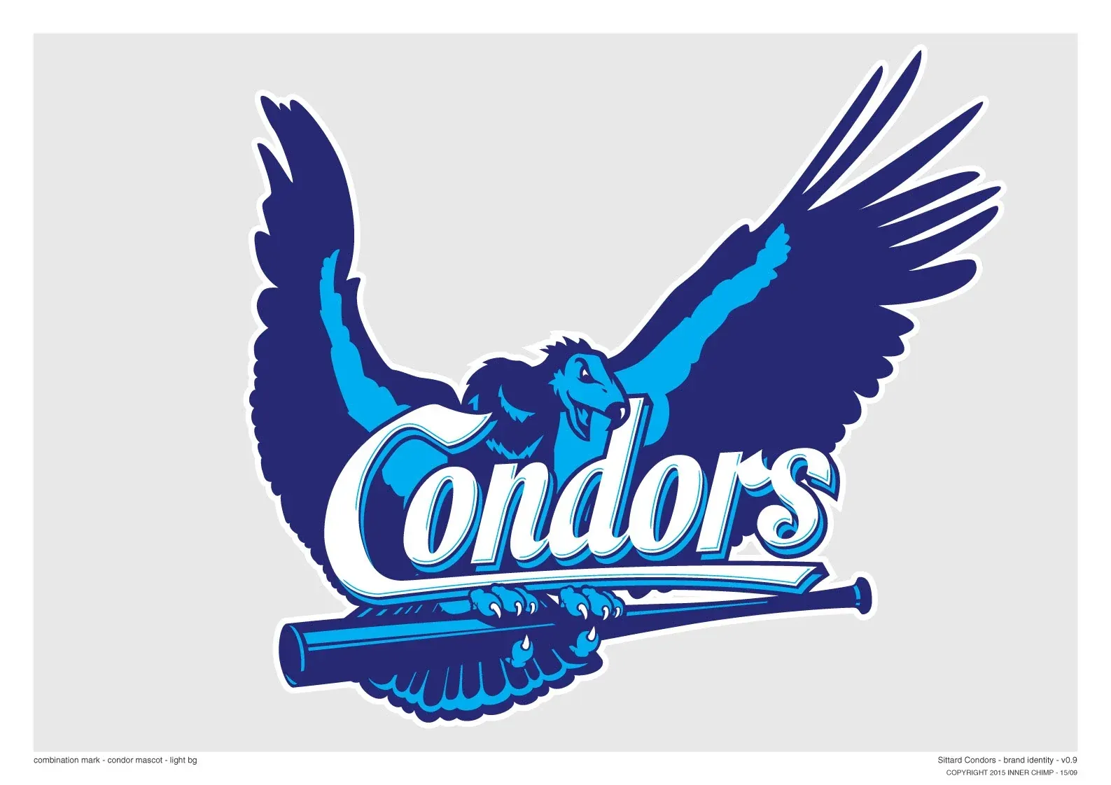
Sittard Condors, a local baseball club, was ready for a refreshed identity. Working closely with a project group to define the direction, I developed a new logo that captures the club's character, energy and competitive spirit, while staying true to its signature two shades of blue.
The Approach
Inspired by the condor's impressive wingspan and the bold mascot-driven identities of MLB and college sports teams, I set out to create a logo that felt approachable yet fiercely competitive.
The outstretched wings give the emblem its powerful silhouette, while a baseball bat immediately connects it to the sport. The two shades of blue reveal another layer: raised fists hidden within the wings, symbolising celebration, team spirit and the drive to win.
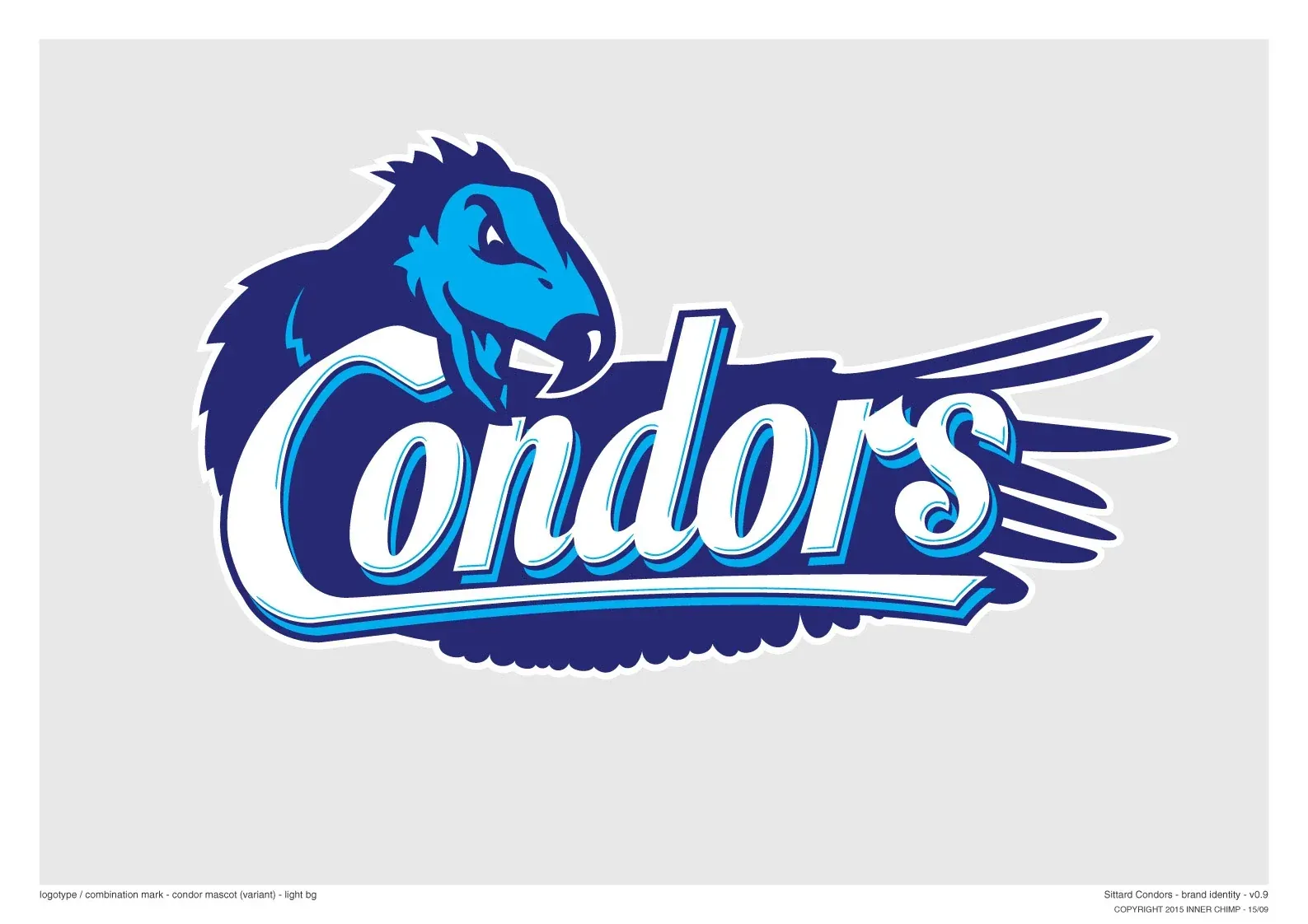
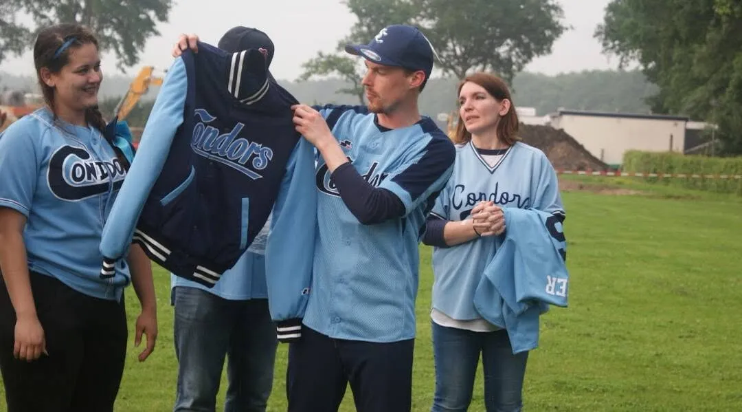
The complete emblem became the foundation for a flexible visual identity, with individual elements adapted into a cap monogram, an alternative condor-head mark and lettering for team apparel.
Project highlights
Born to Compete
Inspired by the condor's powerful wingspan and the expressive world of American sports identities. Bold, recognisable and full of competitive spirit.
Outstretched wings, raised fists and two shades of blue. A subtle second layer that celebrates the energy, pride and winning mentality of the club.
One Identity, Many Forms
From the full emblem to cap marks and team lettering, individual elements come together as one recognisable visual identity.
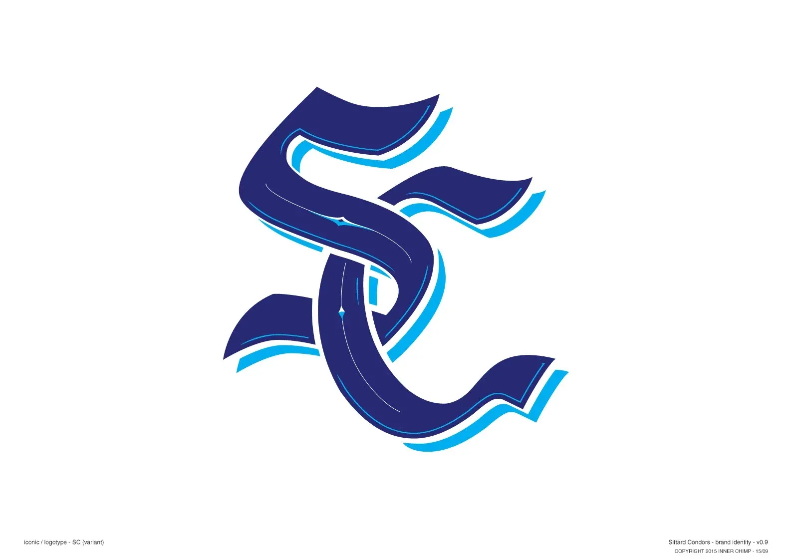
Detailed monogram
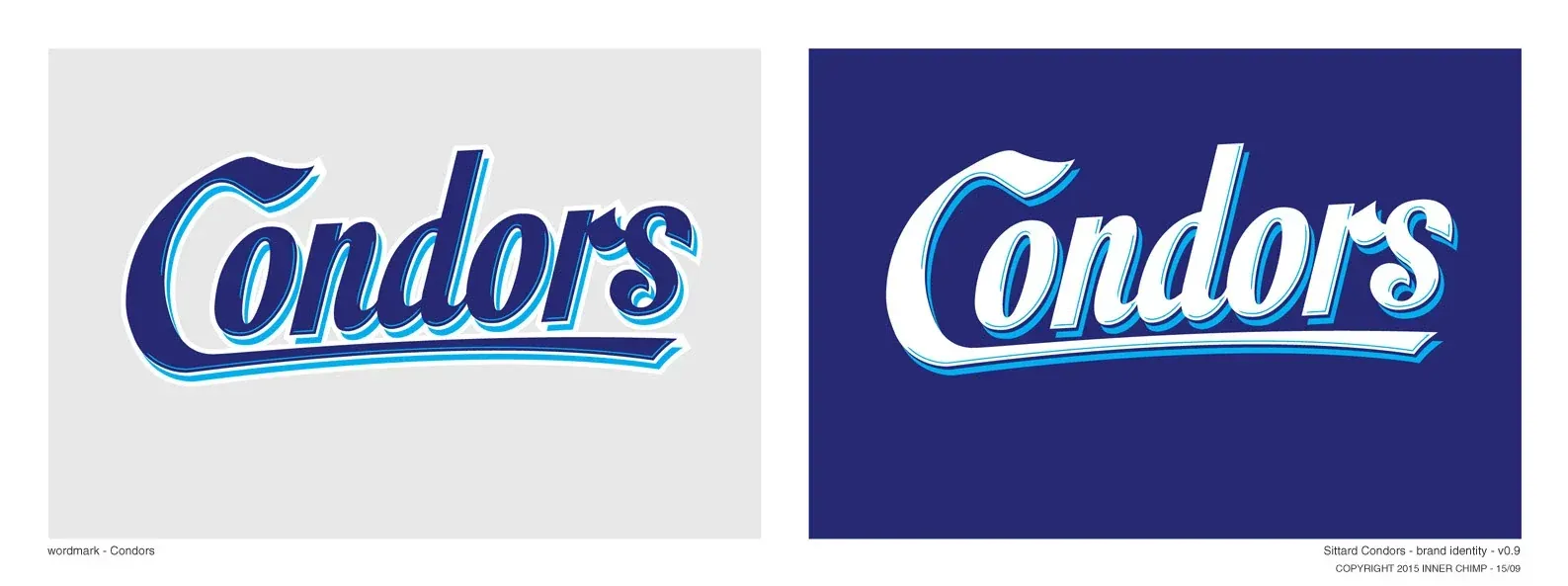
Word mark, for use on team jerseys
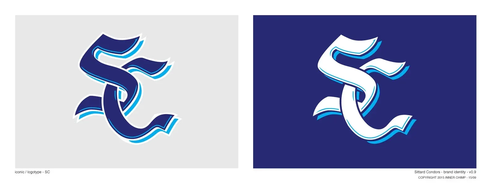
Monogram for use on caps
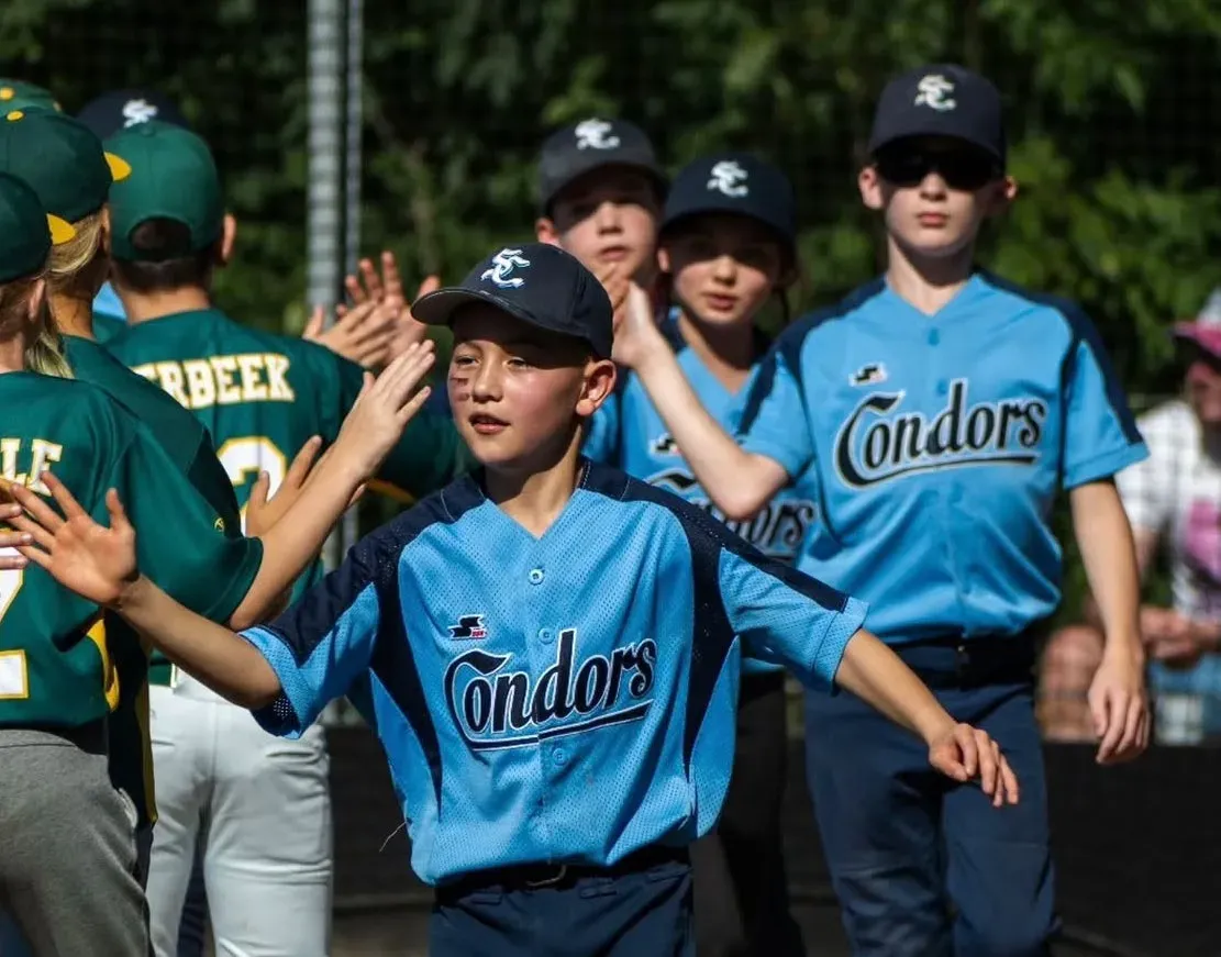
Shirt worn during game by Sittard Condors youth team
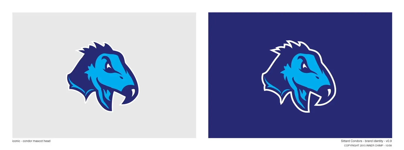
Head mark